Creating scroll stopping content is no longer optional. It’s survival. Attention is scarce, and the truth is you only have two seconds, sometimes less, to make someone pause. If you don’t win those first moments, nothing else you do matters.
Think about it: in two seconds, a viewer has already decided whether to watch, read, or swipe past. That decision happens almost subconsciously. Which means the real challenge isn’t “how do I make a great video?” It’s how to stop the scroll before people even realize they’ve made a decision. And that’s where the art of attention grabbing content comes in.
Let’s break it down.
Why Two-Second Rule Everything?
You’ve felt it yourself. You’re scrolling Instagram, TikTok, or YouTube Shorts. Something flickers into view. Before you’ve even thought about it, you’re either hooked or gone. That snap judgment happens in under two seconds.
This is why scroll stopping content isn’t just about quality—it’s about immediacy. A beautiful three-minute film doesn’t matter if the opening frame doesn’t hook. The two-second window is the filter, the gatekeeper, the make-or-break moment.
How to Stop the Scroll in the First Two Seconds?
The formula isn’t complicated, but it’s strict. If your content doesn’t spark curiosity instantly, it fails. That spark can come from:
- A visual surprise
- A bold question
- A human emotion that feels raw and real
- A movement or sound that jolts the senses
When you plan content, don’t ask “what’s the story?” first. Ask, “What’s the very first thing someone sees, hears, or feels?” That’s how to stop the scroll before it’s too late.
Video Production: Winning the Opening Frame
Video is naturally scroll stopping because motion grabs the eye. But most videos fail because they waste the opening seconds. A logo intro? Gone. A slow fade-in? Forget it.
To pass the two-second test, you need to impact immediately:
- A close-up of an emotional reaction
- An unusual movement or action
- A bold image that raises curiosity
This applies across all types:
- Explainer videos should start with a visual metaphor that hooks, not a narrator.
- Commercials, promos, and TV ads work best when the story begins right away.
- Corporate, educational, and safety films should drop viewers into a scenario, not instructions.
Animation and Effects: Engines of Attention Grabbing Content
Animation, CGI, and VFX stand out in feeds because they break reality. That disruption is what makes them so effective for attention grabbing content.
- 2D animation uses bold shapes and colors to explain big ideas quickly.
- 3D animation adds spectacle, like a product assembling itself in mid-air.
- VFX and CGI create moments of surprise—objects floating, breaking apart, or transforming.
3D Modeling: Products That Demand Attention
Flat product shots rarely stop anyone anymore. They’re everywhere. 3D modeling changes that give products motion, depth, and life.
Examples:
- A sneaker twists 360 degrees before you can blink
- A phone exploding apart to show its inner design
- A watch zooming in on its intricate details
This isn’t just pretty—it’s practical. In e-commerce, 3D models let shoppers see more in less time. In tech, they highlight features at a glance. In architecture, they invite people into the space instantly. That’s how to stop the scroll with products.
3D Visualization and Interior Design: Selling the Dream Quickly
Spaces are best sold through feeling, not specs. A floor plan won’t stop anyone. A realistic 3D visualization will.
Picture this:
- A lobby is lit up as the camera glides through
- A bare apartment transforming into a finished design in one breath
- A house glowing in the sunset as the perspective zooms in
The first two seconds have to create an emotional “wow.” That’s the difference between being ignored and making someone imagine themselves inside.
Photography and Creative Visuals: One Shot, One Chance
Sometimes, one still frame is enough to stop the scroll. But it has to be intentional. The best photography doesn’t just look good—it tells a story instantly.
What works:
- Contrast: bold colors against muted backdrops
- Emotion: laughter, shock, intensity
- Action: water splashing, fabric flying, sparks mid-air
That’s what makes photography more than decoration. When crafted right, it becomes attention grabbing content that passes the two-second test.
AR, VR, and the Metaverse: Stopping the Scroll Through Play
Interactivity is magnetic. When people see an AR filter preview or a VR clip, they make a choice instantly: try it or scroll past.
If the first two seconds look fun, immersive, or surprising, they stop. If not, they won’t.
The same principle applies to metaverse content. Start with the wow moment. Make people feel like they’re stepping into something new. That’s how to stop the scroll when the competition is everything else on their screen.
Educational and Safety Content: Serious Still Needs Hooks
Even serious topics have to pass the same filter. If you want people to watch, you need to hook them first.
- A safety video that starts with a dramatic accident scenario will grab attention.
- An educational video that opens with a surprising fact makes people curious.
If you don’t make the audience care in the first two seconds, the lesson won’t land.
The Psychology of Scroll Stopping Content
The mechanics of attention are universal. Our brains are wired to notice:
- Movement in our field of view
- Faces, especially expressions and eye contact
- Contrast in color or light
- Surprise, anything that breaks routine
- Questions that spark curiosity instantly
That’s why lines like “Ever wondered how to stop the scroll in less than two seconds?” make people pause. They trigger curiosity before logic kicks in.
Storytelling: Don’t Waste the Attention You Earn
A hook without a story is wasted. You can win the pause, but if you don’t deliver, they’ll leave as fast as they came.
The simplest arc works every time:
- Hook in the first two seconds
- Build intrigue in the middle
- Deliver a payoff at the end
Scroll stopping content buys you time. Storytelling makes it worth spending.
Beyond Formats: What Truly Creates Attention Grabbing Content
Here’s the thing: services and formats matter, but they aren’t the whole story. If you want content that consistently stops the scroll, you also need:
- Copywriting and Hooks: sharp headlines and overlays that spark curiosity
- Music and Sound: trending audio and crisp sound effects that hit immediately
- Editing Pace: tight, snappy cuts that keep energy high
- Platform Fit: vertical for TikTok, professional tone for LinkedIn, quick loops for Instagram
- Authenticity: raw, relatable moments can outperform polished ads
- Trends and Timing: cultural context often makes or breaks engagement
- Clear Next Step: a scroll stop is just the beginning—what happens after?
These layers transform visuals into attention grabbing content that works consistently, not by accident.
Quick Checklist for How to Stop the Scroll
Before you post, ask yourself:
- Does the first frame spark curiosity instantly?
- Can the hook be understood in two seconds or less?
- Is there motion, emotion, or surprise right away?
- Is the edit tight and platform-optimized?
- Does it feel authentic, not staged?
- Does it lead somewhere once I’ve got their attention?
If not, you’re not ready to post.
Bringing It All Together
So, how to stop the scroll when everyone is fighting for those same two seconds? You put the opening above everything else.
- Video gives you movement.
- Animation and VFX give you a surprise.
- 3D modeling and visualization make products and spaces unforgettable.
- AR and VR make people play instead of swiping.
- Photography delivers instant impact.
- Copywriting, sound, editing, authenticity, and timing elevate everything.
Formats vary, but the principle stays the same: if you don’t win attention in two seconds, you don’t win it at all.
Final Takeaway
Attention isn’t lost at 30 seconds. It’s lost in the first two.
So the next time you plan content, don’t ask “What should we post?” Ask, “What happens in the first two seconds that makes this impossible to ignore?”
That’s the real secret to creating scroll stopping content—content that captures attention instantly, delivers a story worth staying for, and lives on as truly attention grabbing content.
How 3DTRIXS Can Help You?
At 3DTRIXS, we know those first two seconds make or break your content. That’s why our work is focused on delivering visuals that don’t just look good but actually stop people mid-scroll.
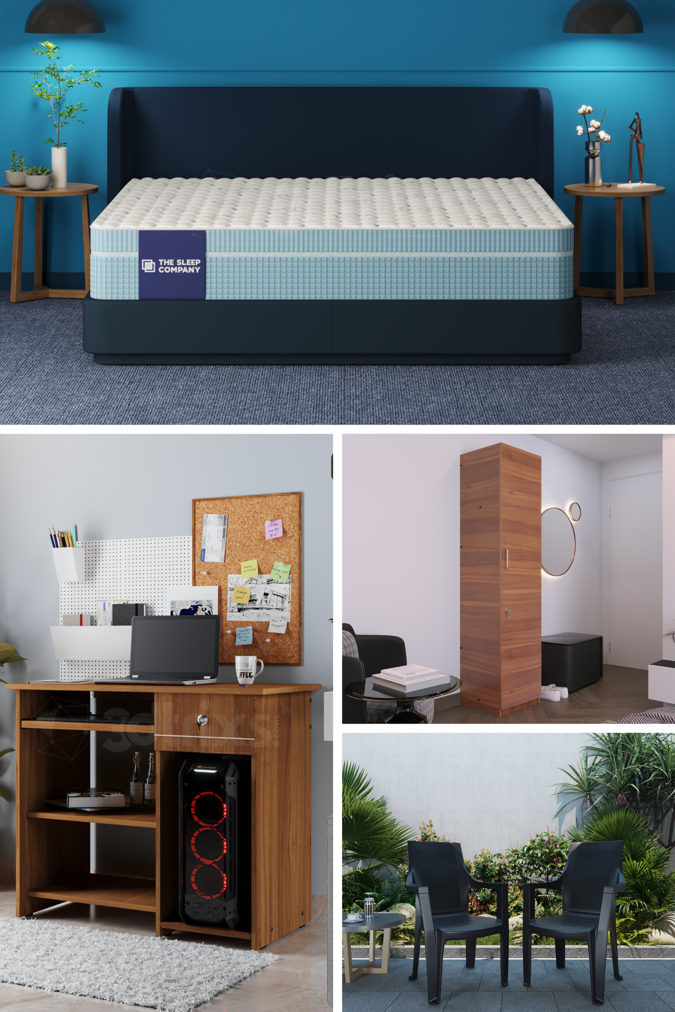
We create photorealistic 3D product renderings, dynamic product animations, engaging explainer videos, and immersive AR and VR experiences—all designed to grab attention instantly. Over the past decade, we’ve completed more than 8,000 projects for leading brands like Amazon, Intel, Deloitte, Toyota, Titan, and Bosch, helping them stand out in crowded feeds and digital spaces.
Whether it’s showing your product in motion, breaking it apart in 3D, or creating a short story that hooks viewers in the first moments, we bring every creative solution under one roof. Our goal is simple: make your content impossible to ignore.
Founded: 2014
Team Size: 40 to 50 Employees
Clients: Amazon, Paypal, Deloitte, Levis, Intel, EY and many more.
Pricing: $1,000+
Completed Projects: 8000+ | Clients: 800+ | Serving Countries: 15+


